Showing posts with label Design. Show all posts

Tuesday, 28 July 2009

MahaNakhon – Bangkok’s ‘Great Metropolis’


This week in Dezeen I spotted an article on the plans for MahaNakhon by Ole Scheeren of OMA. Not only was I grabbed instantly by the beauty of this architectural giant, I was also amazed at the detail and inclusivity of its design.


The building that will become Bangkok’s largest skyscraper is a glass tower constructed of a staggering 77 floors. More interestingly though is that the design moves beyond the traditional seamless, glossy totem and includes a ribbon of seemingly pixelated floors creating beautiful aesthetics with practical and stunning design functionality. The 3 dimensional ribbon wrapping around the tower will provide uninterrupted panoramic views and terraces, as if excavating outdoor space from the depths of the glittering glass masterpiece.


Due for completion in late 2012 the building will include The Ritz Carlton Residences, a public plaza, retail space, 200 homes, restaurants, bars and a stunning multi level 3 floor Sky Bar and Restaurant allowing you to entertain at over 1,000 feet above the city.

Posted by: Roz

Tuesday, 10 February 2009

BACK COVER ISSUE 1/NUMERO 1 Design Graphique, Typography, etc.


Back Cover is a new design publication from France. Rather than current work and trends its focuses on the designers influences and inspirations. All editorial content comes in both French and English.
Posted by: Matt

Wednesday, 9 May 2007

DKPM - Sing The Hits!

At DKPM, we’ve created the new graphic identity, packaging designs and point of sale materials for the latest Sony Playstation SingStar game – SingStar: Pop Hits.

They are in stores ‘now’ throughout Europe, Australia and New Zealand, so be sure to head down to your nearest retailer and pick up this fantastic fun game!

This SingStar game has all sorts of music for all music lovers. So, why not buy two copies; one to play and one to hang on your wall?

Posted By: Dan

Jewish Museum

My sister in Law an architect and she said you can't go to berlin without seeing the Jewish Museum museum. How right she was.

It’s probably one of the best pieces of Architecture I’ve ever visited, both aesthetically and emotionally. It was designed by
Daniel Libeskind, and architecturally, A very brave building symbolising a very delicate subject.

The building is very distinctive - blurring the lines between architecture and sculpture. It’s not designed to fulfill any functional requirements. Its purpose is to create a series of provocative and symbolic spaces that tell the story of the Jewish people in Germany.

Posted By: Matt

Beachside Brew

Southwold, on the Suffolk coast, is the home of the longstanding Adnams Brewery. This brand markets itself wonderfully, capturing the essence of timelessness and long sunny days by the sea.

The tranquility of a small fishing town is reflected in their strong visual identity.

Just look at the high production values and the quality of illustration in their promo cards...

Check out the ingenious design they’ve used to package three beers together with a pint glass – it makes a perfect gift! They also have a Broadside Beer flavoured run of Kettle Chips, mmmm delicious!


Posted By: Dan

Furtive Fashion

If you’ve gone to the beach and wanted to find some way to stash your valuables, without having to lug a bag around or find an elusive bikini with pockets, then these may be the answer.

These flip-flops, from premium surf brand Reef feature discrete slide away drawers in the soles. Not sure how waterproof they are, but you can check out the range in more detail here.


Posted By: Linda

Thursday, 12 April 2007

Funky Brochure

I picked up this funky brochure for sleek Italian brand Patrizia Pepe from a shop down Ecclesall Road in Sheffield.

I love the way it’s made from one continuous sheet, folded up to create the individual pages. The glossy photography is lush and the embossed spot UV cover makes this a quality piece of design.

Posted By:
Yvette

Doodle Disks

Datawrite specialise in recordable CD and DVD discs. They create a range of on-body disc designs and recently launched a competition to help British art students achieve worldwide exposure.


The 10 winning artists have had their work published on a new range of discs called Scribbles, which all look great.


Posted By: Linda

When the Clouds Clear

Charlie Alex March’s ‘When the Clouds Clear’ EP, 3″ CD, with a limited edition print by Yokoland.

It’s such an interesting format for CD packaging and it experiments with the boundaries of print.

It's great to have something tangable, rather than a software file. I really like it and I’m never opening it!


Posted By:
Matt

Perfectly Packaged

Packaging is an integral part of any consumer product; providing information and self promotion. Of course the best packaging combines these features with an irrepressible urge to make you pick it up and have a fiddle…


Check out this special ‘Parka Pak’ DVD packaging by AGI Media for the Northern Exposure DVD. It’s quite unlike anything else you’ve seen, but ties in with the brand so well. Even if you’ve never heard of the show, you’ll definitely want to have a go on the moose pull zipper!

Posted by: Richard

Mint Advertising

Spotted these clever ads for Mentos, they feature a series of Mentos blister packs with the missing mints punched out to create images. Apparently the street level ads are actually made out of ‘real’ Mentos gum packages!


They complement a fantastic micro-site where visitors can create, save and display their own designs, create yours here.

Posted By: Davey

Thursday, 1 March 2007

Medex Training

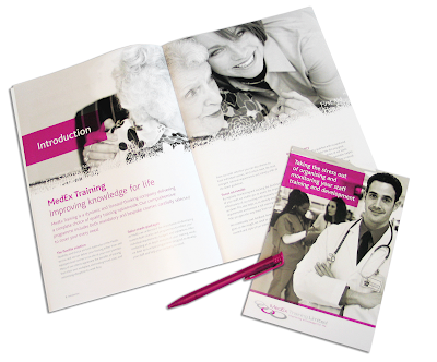
MedEx Training Limited appointed DKPM at the end of 2006 to help define and create their new corporate identity, including their inspirational positioning statement, 'improving knowledge for life'.

I love their new identity because it demonstrates the real personalities within the MedEx business and looks sharp and fun, while still being professional and corporate. A brave use of bright pink I’d say… and it totally works!

So far, we’ve created a suite of new training literature, leaflets, branded promotional items and their new website; check it out at:
www.medextraining.com

Posted By: Clare

Map of Realities

Saw these posters a while ago for the launch of BBC World News in America. Love them because like all the best advertising, you need to take a second look before you get it… once you do, you’re bound to remember them!

On first impressions, the ads look like geographical territories on a map; take a look closer, you see what they really are!

The tagline is ‘News beyond your borders’. They certainly drive that point across…

Posted By: Davey

Dr Stuart's Tea

Extraordinarily good teas: extraordinarily great packaging. The pack designs are so different to other tea brands, something which couldn’t be said of their old packaging.

See the website for some of the strangest characters on the internet; you certainly won't forget this brand anytime soon!
www.drstuarts.com

Posted By: Linda

Pet Shop Boys Website

An unusual, but very nice approach to website menus - using simple Flash & lovely Swiss typography: both things working very well together.

Have a look for yourself:
www.petshopboys.co.uk/

Posted By: Matt

Cereal Naturally...

Spotted these creative packaging designs for Dorset Cereals. The pack sizes, materials, colours and see through sections draw your attention to the textures and makes the brand stand out as an appealing natural, healthier choice. Tastes bloomin’ brilliant too!

This range of packaging was also commended in the
2007 Design Week Awards.

Posted By: Yvette